Today, we wrap up my series on learning how to test the usability of your website and donation form. To quickly recap, usability testing is an excellent tool if:
- You fear you’re losing donations because of your website’s design
- You want to make a solid business case for design resources or even a redesign
- You’re redesigning your site and you want to get it right
Thus far, the series has covered the importance of testing, how to design your test, recruiting, and running your test.
Now that you’ve wrapped up your testing, you may say to yourself, “I came, I conquered, I’m done” but now is the time to creatively evangelize the data you’ve collected. It’s also a excellent time to show what a champion you’ve been to your organization by doing usability testing.
Here’s some ways that designers at Blackbaud keep test results meaningful, succinct, and powerful to stakeholders.
Infographics: all the cool kids do ‘em
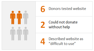
Don’t share a lot of dull numbers. A simple infographic of your most compelling points re-enforces that you’ve testing your website objectively and systematically.

Summarize your problem children
Your list doesn’t need to be exhaustive, but should always include a “hit list” of usability issues a future design will squash. Here’s an example:
These issues impacted almost all participants in our testing:
- Donors found the labeling of our navigation, form fields, and page titles to be confusing and misleading
- Donors found the home page to be visually overwhelming because of the amount of text, images, and colors
- Donors found the overall website design to be unpleasant and described with phrases such as “not very modern”
- Donors found the number of fields on the donation form to be frustrating and unnecessary
- Donors found the donation form to appear “unsecure” and “not very trustworthy”
Smile for the camera
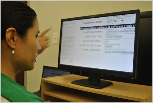
A single photo of a real donor test driving your website is always a “must” for communicating, “We found real donors and we dug hard to get real unvarnished data”. The photo below is from our Everyday Hero testing snapped with an iPhone. Easy.

Let your participants speak for themselves
If you collected some juicy quotes, you don’t need to add much color commentary. Just list quotes verbatim and then step aside. Done. Here’s some punchy quotes I’ve received in the past:
- "This definitely seems a lot cleaner and more streamlined than last year’s website…"
- "Looks like a better design and face than what we have right now.”
- “Old site looks kind of amateurish."
Highlight reels are powerful
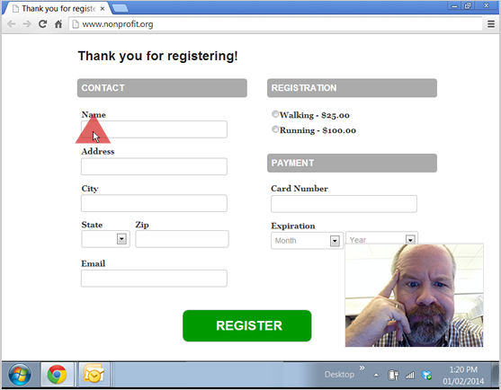
If you recorded your session, a montage of important moments can really make your stakeholders’ mouths fall open. But you don’t have to be Godard. Just keep your videos short with a simple intro title card to make your point.

The screenshot above is from TechSmith’s Morae but recordings from web conferencing tools like WebEx and GoToMeeting work just as well for quick testing.
What should a recap of testing include?
At minimum, I suggest you put your results into a 5-6 slide deck which covers:
- Overview: what and who was tested
- Takeaways: what’s broken and what works
- Color: key quotes, photos, and videos
- Action items: what needs to be fixed
Some other tips for showing your results to stakeholders…
Stay balanced
If you already have strong feelings about your website’s design, don’t lose your credibility by sounding like an axe grinder with only gloom and doom to share.
If things worked well on the site, be honest about it. Start positive and then focus on areas of improvement. Don’t speak as the design expert, but as a researcher with facts on your side.
Speak your stakeholders language
Your stakeholders likely don’t care about usability testing or know about conversion rates. But everyone in your organization cares about lost donations. If you can impassionately illustrate “this is why our website design is costing us donations” then you’ve won.
Don’t forget to answer, “Okay, now what?”
If you’ve sold your stakeholders, don’t fumble when they ask for your opinion. Have your design recommendations and action plan ready when you are asked!
If you’ve found this series to be helpful, please let me know. Also, feel free to send questions and maybe some success stories my way! I want to hear them! Good luck!
No comments:
Post a Comment