We all love a good infograhpic.
When done right, infograhpics are exciting, simple to digest, fact-filled, shareable and all together useful for anyone who crosses their path.
Because they’re so visually compelling and engaging, it’s no wonder there’s been a phenomenal spike in interest.
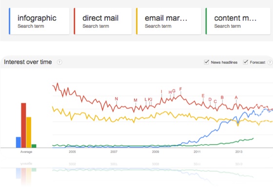
The volume of searches for "infographic" has already surpassed searches for "email marketing" and will very soon be equal to searches for "direct mail".
Staggering.
Just think about it for a minute. Now, take a look at the graph from Google trends below. Search volume for the term "infographic" is represented by the blue line.

While infographics may be hot, they’re not all created equal. Some are so amazing you HAVE to immediately share them; while others are so bad they make you hit the back button faster than Austin Wierschke can send a text to a friend.
What gives? How can one infograhpic be great and another make your eyes hurt?
Let's take a look at 7 tips that will ensure your next infographic is a huge success.
1) Follow the Data
Here's how it normally goes… Someone says , "We need an infographic about XYZ". From there, you go out, higher a graphic designer (or talk to your internal staff), tell them your idea and they get started. This process is an all too common mistake that has failure written all over it. I know- I've been guilty of it many times.
Instead of starting with the story, start with the data.
Infographics are meant to be data driven and the data should play the key role in the conceptualization of your infographic. Dig into the data. Think about what it's telling you, what insights are being revealed and how the data can be made the hero.
I’m not insinuating that you stop dreaming up great ideas for infographics - without great ideas, we would all be hitting the back button- but before you go too far down a path, make sure you’ve got data as your guide.
2) Know Your Audience
Knowing your audience is critical. If you know whom you want to consume your infographic, you’re able to tailor the language, imagery, focus, and key points used to appeal to this target audience.
Essentially, you can be sure you’re creating a piece that will resonate with the people you're trying to reach.
The alternative is to create something for no one. As you can imagine, doing so will likely leave you with an infographic that interests…
Yep. You got it: No One.
3) Decide on the Platform(s)
This one is easily forgotten.
I recently forgot to consider the platforms I wanted the latest Blackbaud Next Generation of American Giving infographic to work on. By the time I thought to make sure it worked well on smartphones it was too late. So I ended up with a less then optimal small screen viewing experience for you – our audience.
Before you get into creation mode, you need to decide which platforms you want it to work on. Do you want people to easily access it on their iPhone? Should it work well on a tablet? How about a laptop or desktop screen?
Identifying the screen sizes you want your infograhpic to work on will help you make better design decisions up front and keep you from agonizing at the end when you find out that it doesn't look good on a certain screen size – like I did recently.
Do yourself and your audience a favor- don't forget this important step.
4) Craft Your Story
It's not just about visualizing data in a fun way; it's about communicating something important to your audience. A story. One that sticks.
Once you know what the data is telling you and the audience you want to reach, you can start to script out the story you want to tell. It's best to do this on paper. Just write it out. Draw a flow if it helps. But don't worry about the creative or imagery at this point- these will follow naturally after you have your story.
Every good story has a beginning, middle and end that follows the path of your most important element: your hero. Consider the key-message you want to leave with your audience and then craft the journey that will ensure it sticks.
Put in the time to think it through, write it down and build the perfect data-driven story. It will pay huge dividends in the long run.
5) Keep it Simple
The beauty of the iPone is in its simple design. Making something that’s simple and easy to use or understand is incredibly difficult to do, but when it's done well it has a huge impact on the results.
When it comes to infographics, this principle is extremely relevant. We've all seen infographics that are overwhelming, confusing and hard to look at. This was because they failed to heed one critical point: simplicity. At every step of the creation process you should be thinking, "simple".
Edit. Reduce. Cut.
Ensure you communicate the key elements of your story. If there's more you need to tell people, have them download the full report, go read about it on your blog or watch the video.
Just don’t try to force everything into your infographic. You’ll overdo it.
6) Show, don't Tell
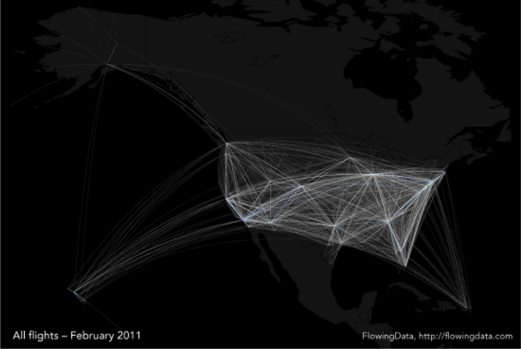
A good infographic doesn't need to use a lot of words. The picture tells the story. Check out the image below.

That's an infographic … one that shows flight patterns. You don't see any text describing it. You just see a picture – A picture that tells you where planes are flying, areas that get the most traffic, where the hubs are, and much more.
It's simple, yet oh so complex.
And it doesn't use any words.
Take note.
7) Facilitate Sharing
My last point is this- If you put in all the effort to follow the advice above, you better make your infographic easy for people to share.
- Add social sharing links (AddThis or ShareThis) on the infographic landing page.
- Embed social sharing elements into the infographic using HTML5.
- Send it to your email list.
- Post it on your homepage.
- Put it on your Facebook page.
- Tweet it.
Do it all so that your target audience can find it.
What’s the point of creating something great if no one ever sees it?
Creating an infographic for your K-12 School.
Check out the slides from my recent #BBCon session (How to Create an Awesome Infographic for your School) where I spoke specifically to an audience of K-12 technologists, marketers and fundraisers. All the above principals apply, but we looked at specific K-12 examples to illuminate the points.
Passing it back to you.
Ok, you know my 7 tips for creating effective infographics. What would you add? Let’s discuss – @franswaa on Twitter.
No comments:
Post a Comment